Newsletter Upgrade Page Examples: 6 Patterns That Convert (2026)
6 newsletter upgrade page examples and the patterns behind them — benefit-led headlines, founder pricing, free trials, blurred previews, and more. Plus a copy-ready template and how to test which one converts best.
·

Newsletter Upgrade Page Examples: 6 Patterns That Convert (2026)
The short answer: The newsletter upgrade pages that convert share the same anatomy — a benefit-led headline, a clear offer and price, specific social proof, one strong CTA, and a taste of the premium content. Below are 6 proven patterns, a copy-ready template, and how to test which one converts best for your audience instead of guessing.
Your upgrade page is where audience turns into income. It's the one screen that has to do the convincing, and most newsletter upgrade pages do it badly — a vague "Go Premium" headline, a price, and a button.
Rather than copy someone else's page wholesale (their audience isn't yours), it's better to learn the patterns that consistently work, then test them. Here are six, the anatomy underneath them, a template you can adapt, and the only reliable way to know which wins.
What makes a newsletter upgrade page convert?
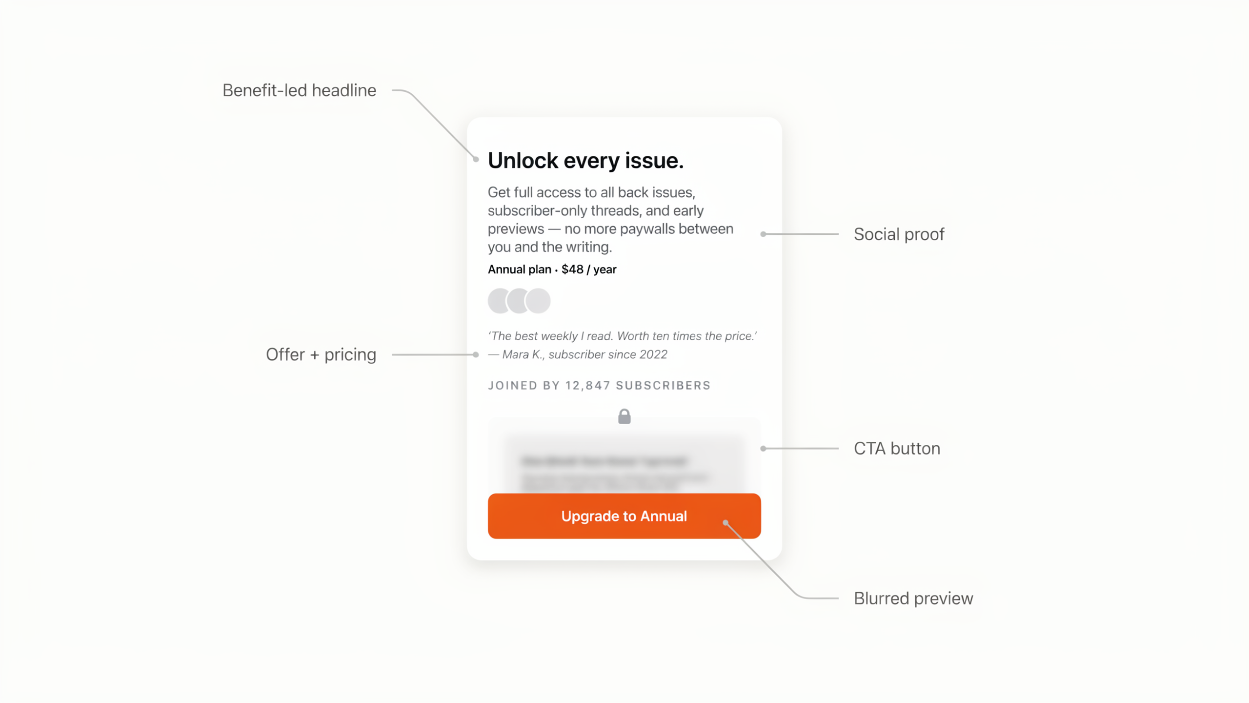
High-converting newsletter upgrade pages share five elements: a benefit-led headline (the outcome, not "Upgrade"), a clear offer and price (with the billing choice framed), specific social proof (numbers and named readers, not "people love us"), one unmistakable CTA, and a preview of the premium value so the reader knows what they're buying. Everything else is decoration.
Keep that anatomy in mind as you read the patterns below — each one is really just a different emphasis on the same five parts.
6 newsletter upgrade page patterns that convert
1. The benefit-led headline
Instead of "Upgrade to Premium," lead with the outcome the reader gets. "Know the three moves that matter before markets open" beats a generic label because it sells the result, not the transaction. This is the single highest-impact change on most pages.
2. Founder / charter pricing
Frame the price as a window that's closing: "Lock in $8/mo as a founding member before it goes to $12." It rewards early readers, creates honest urgency, and anchors the value. Works best early in a paid newsletter's life when you have a "founding" story to tell.
3. The free trial / risk reversal
"Start 7 days free, cancel anytime" lowers the perceived risk of a first payment. The reader experiences the premium content before committing, which suits newsletters whose value is obvious once you're inside but hard to convey on a page.
4. The blurred content preview
Show a real snippet of a recent premium issue with the rest blurred behind the paywall, plus an "Unlock full access" button. The concrete preview makes the value tangible and the blur creates curiosity — far stronger than an abstract list of "what you get."
5. The free-vs-paid comparison
A side-by-side table of what free and paid readers get, with checkmarks, crystallizes the upgrade decision. It works when your premium tier has clear, listable extras (extra issues, archives, community, tools).
6. Quantified social proof
"Join 1,200+ paid members" or "23 readers upgraded this week" near the CTA reduces risk at the exact moment of decision. Proximity to the button matters more than the volume of testimonials — put the proof where the reader's cursor already is.
A newsletter upgrade page template you can adapt
Put the patterns together and you get a structure you can fill in:
- Headline — the outcome the reader gets (benefit-led).
- Subhead — who it's for and how often it lands.
- Offer line — price, billing choice (monthly/annual), and any founder or trial framing.
- Benefits — 3-5 outcomes, not features ("never miss X," not "weekly emails").
- Social proof — a specific number plus one short, real testimonial, near the CTA.
- Preview — a blurred snippet of recent premium content.
- CTA — one button, specific copy ("Start my premium access"), repeated once.
If you're on Beehiiv, most of this maps onto the native paywall fields — see the Beehiiv paywall setup guide for where each piece goes.
How to know which version actually converts
Here's the trap: every pattern above works for someone, and you can't tell which works for your audience by staring at the page. Benefit headline or curiosity headline? Founder price or free trial? The honest answer is always "test it."
Beehiiv can't help here — its built-in A/B testing only covers email subject lines, not the upgrade page. Humblytics runs server-side split tests on the page itself and scores the winner in subscription revenue (MRR), so a higher-priced variant that converts slightly fewer people can still win if it makes more money. It's cookie-free, about 36KB, and starts at $19/month with unlimited tests. The full method is in How to A/B test newsletter upgrade pages, and you can plan your test with the Sample Size Calculator.
Frequently asked questions
What should a newsletter upgrade page include? A benefit-led headline, a clear offer and price with the billing choice framed, specific social proof near the CTA, one strong call to action, and a preview of the premium content. Skip anything that doesn't push the upgrade decision forward.
What's the best headline for a newsletter upgrade page? One that names the outcome, not the transaction. "Get the trade ideas before markets open" beats "Upgrade to Premium" because it sells the result the reader actually wants.
Should I offer a free trial or a discount on my upgrade page? Both work, for different audiences. A free trial suits newsletters whose value is obvious once you're inside; a founder discount suits early-stage paid newsletters with an urgency story. Test the two against each other rather than assuming.
How do I build an upgrade page on Beehiiv? Use Beehiiv's native paywall, which covers the title, description, benefits, button, offer, and styling. See the Beehiiv paywall setup guide for the step-by-step.
How do I know which upgrade page converts best? Split-test it. Beehiiv can't test pages, so use a page-level tool like Humblytics to run two versions and read the winner in subscription revenue.
Sources
- How to create and apply standard paywalls — beehiiv Help (paywall fields and structure)
- The Audiencers — What explains subscription conversion success (paywall conversion benchmarks)
- Email A/B Testing Tool for Newsletters — beehiiv (native testing is subject-line only)
One install replaces GA4, Hotjar, and your A/B tool.
36KB script. Cookie-free. Agent-native. UI Collective added 3% signups in week one. 14-day trial, no card.