
How to Write an A/B Test Hypothesis: Template and 15 Examples by Page Type
A fill-in A/B test hypothesis template, where to find the evidence behind it, 15 example hypotheses for landing pages, pricing, signup forms, checkout and lead forms, a weak vs strong table, and how big a change has to be before a test can detect it.

The short answer: As of October 8, 2026, a useful A/B test hypothesis fits one sentence: Because we observed [evidence], we believe [change] for [audience] will [effect on metric], measured by [primary metric] with [guardrail]. The evidence slot is the part most teams skip and the part that matters most. Source it from analytics drop-offs, heatmaps, funnels, customer research, support tickets and surveys. Then check that the change is big enough to detect: by the formula behind our calculators, resolving a 20% relative lift takes roughly 400 conversions per variant, whatever your baseline conversion rate.
TL;DR
- Use the template. If you cannot fill the "because we observed" slot with something real, keep researching before you test.
- Name one primary metric and one guardrail metric before launch, not after.
- Below are 15 example hypotheses grouped by page type, each with its metric.
- Prioritize with ICE or PIE, then filter by traffic: small sites should only test changes big enough to move a metric 20% or more.
- Stuck for ideas? The free A/B test ideas generator gives you a starting list to turn into hypotheses.
What a hypothesis does that a test idea does not
"Test a shorter form" is an idea. It tells you what to build. It does not tell you why, for whom, or how you will know it worked, so when the test ends you have a number and no lesson.
A hypothesis fixes that in three ways:
- It ties the change to evidence. You test because you saw something, not because a competitor did it.
- It fixes the measurement in advance. Choosing the metric after the data comes in is how teams talk themselves into false wins.
- It makes a loss useful. If the evidence said visitors were confused by pricing and a clearer pricing table did nothing, you learned the confusion is not what holds them back. That narrows the next test.
The fill-in template
Copy this and fill every bracket:
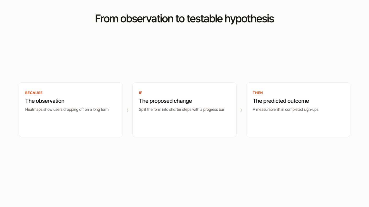
Because we observed [evidence: a number, a pattern, a quote], we believe [specific change] for [audience: all visitors, mobile, paid social traffic, returning visitors] will [direction and effect on behavior], measured by [one primary metric] with [a guardrail metric that must not drop].
What each slot is for:
| Slot | What goes in it | Common mistake |
|---|---|---|
| Evidence | A specific observation from data or research | "Best practice says" or "I think" |
| Change | One change, or one coherent set of changes, described precisely | "Improve the page" |
| Audience | The segment that will see the variant | Testing everyone when the problem is mobile only |
| Effect | Direction plus the behavior that should change | No direction ("will affect signups") |
| Primary metric | The single number that decides the test | Picking three and calling whichever wins |
| Guardrail | A downstream or quality metric that must hold | None, so a variant that inflates low-quality leads "wins" |
Where the evidence comes from
The "because we observed" slot should point at something you can show a colleague. Six sources cover almost every hypothesis:
- Analytics drop-offs. Pages with high exit rates relative to their traffic, or traffic sources that convert far below the site average. Paid traffic that lands and leaves is a strong candidate because you are paying for every visit.
- Heatmaps. Click maps show dead clicks (people clicking things that are not links), ignored calls to action and attention pulled to the wrong element. Scroll maps show how much of the page people actually see; if the average visitor stops above your pricing or proof, that is evidence. Our roundup of heatmap tools covers the options.
- Funnels. A step-by-step funnel shows exactly where people leave: landing page to form, form start to form submit, cart to checkout. The step with the biggest drop is usually the step to test first.
- Qualitative research that does not depend on recordings. Five customer interviews, a one-question on-page poll ("What almost stopped you from signing up today?"), or a moderated usability test where you watch someone attempt the task. These tell you why the funnel leaks, which the numbers alone cannot.
- Support tickets and sales calls. Repeated pre-purchase questions ("Does this work with Shopify?", "Can I cancel anytime?") are objections the page is not answering.
- Surveys. Post-purchase or post-signup surveys asking what nearly stopped people, and exit surveys asking what was missing. Look for the same answer showing up again and again.
Strong hypotheses usually combine one quantitative source (where people leave) with one qualitative source (why they leave).
15 example A/B test hypotheses by page type
The numbers in the evidence slots are illustrative. Replace them with your own.
Landing page
- Message match for paid traffic. Because we observed paid social visitors bounce at 78% against 52% for organic, and the ad promises "set up in 10 minutes" while the headline talks about features, we believe a headline that repeats the ad's promise for paid social visitors will increase clicks to the signup page, measured by landing page to signup click-through rate with signup completion rate as the guardrail.
- Proof above the fold. Because our scroll map shows 60% of mobile visitors never reach the customer logos and testimonials, we believe moving one testimonial and the logo row directly under the hero for mobile visitors will increase trial starts, measured by trial start rate with bounce rate as the guardrail.
- One primary call to action. Because our click map shows hero clicks split almost evenly between "Book a demo" and "Start free trial", and demo bookings convert to paid at a lower rate for our self-serve plan, we believe showing only "Start free trial" in the hero for all visitors will increase trial starts, measured by trial start rate with demo bookings as the guardrail.
Pricing page
- Default billing period. Because our pricing page shows most visitors never toggle between monthly and annual, we believe defaulting the toggle to annual billing for all visitors will increase revenue per visitor, measured by revenue per pricing page visitor with total paid conversions as the guardrail.
- Answering the top objection. Because 30% of pre-sales support tickets last quarter asked whether plans can be cancelled anytime, we believe adding "Cancel anytime, no contract" beneath each plan's button will increase plan selections, measured by checkout starts from the pricing page with refund rate as the guardrail.
- Recommended plan. Because our funnel shows visitors who view the plan comparison table convert at half the rate of those who click a plan directly, we believe highlighting one recommended plan with a one-line "best for" description will increase plan selections, measured by pricing page to checkout rate with average order value as the guardrail.
Signup form
- Remove a field. Because our form analytics show 61% of mobile visitors who start the signup form abandon at the phone number field, we believe removing the phone field for mobile visitors will increase completed signups, measured by signup completion rate with trial-to-paid rate as the guardrail.
- Social sign-in. Because exit survey answers repeatedly mention "too many steps", we believe adding "Continue with Google" above the email form for all visitors will increase completed signups, measured by signup completion rate with activation rate (first key action within 7 days) as the guardrail.
- Show what happens next. Because three of five customer interviewees said they hesitated because they did not know whether a card was required, we believe adding a two-line "What happens next" note beside the signup button will increase completed signups, measured by signup completion rate with trial-to-paid rate as the guardrail.
Checkout
- Cost surprise. Because our funnel shows the largest drop is between cart and the shipping step, and support tickets cite unexpected shipping costs, we believe showing the shipping cost on the cart page for all visitors will increase completed orders, measured by cart to purchase rate with average order value as the guardrail.
- Guest checkout. Because our click map shows heavy activity on the "Forgot password" link during checkout, we believe making guest checkout the default option for first-time visitors will increase completed orders, measured by checkout completion rate with repeat purchase rate at 60 days as the guardrail.
- Reassurance near the pay button. Because a post-purchase survey shows "Is my payment secure?" as the most common hesitation for first orders, we believe adding the returns policy and payment security note directly beside the pay button will increase completed orders, measured by checkout completion rate with refund rate as the guardrail.
Enrollment or lead form
- Split a long form into steps. Because our funnel shows 70% of visitors who start the request-information form leave before submitting, and the form shows 11 fields at once, we believe a two-step form (contact details first, program questions second) for all visitors will increase submissions, measured by form submission rate with qualified lead rate as the guardrail.
- Program-specific landing pages. Because paid search visitors arriving on the general admissions page convert at a third of the rate of those landing on a program page, we believe sending program keyword traffic to the matching program page with the form embedded will increase inquiries, measured by inquiry submission rate with application start rate as the guardrail.
- Specific call to action. Because admissions staff report most phone inquiries ask about deadlines and cost, we believe changing the form button from "Submit" to "Get deadlines and tuition" will increase submissions, measured by form submission rate with application start rate as the guardrail.
For more on testing in admissions, see our guide to A/B testing enrollment landing pages.
Weak vs strong hypotheses
| Weak | What is missing | Strong |
|---|---|---|
| "Changing the button color will increase conversions." | Evidence, audience, specific metric | "Because our click map shows the call to action gets fewer clicks than the secondary link next to it, we believe making it the only high-contrast element in the hero will increase clicks to signup, measured by hero CTA click-through with signup completion as the guardrail." |
| "A new homepage will perform better." | Everything; too many changes to learn from | "Because 64% of visitors leave the homepage without scrolling, we believe replacing the abstract headline with one that names the outcome will increase scroll past the hero, measured by visitors reaching the features section." |
| "Shorter forms convert better." | Evidence from your own site | "Because 45% of form starters drop at the company size field, we believe removing it will increase submissions, measured by form submission rate with sales-qualified lead rate as the guardrail." |
| "Adding testimonials will build trust." | A measurable outcome | "Because exit surveys say 'not sure it works for my business', we believe adding two testimonials from customers in our top industry beside the form will increase trial starts, measured by trial start rate." |
| "Lower prices will increase revenue." | Guardrail; may win on conversions and lose on revenue | "Because the annual plan sells to 12% of buyers, we believe a clearer annual savings label will increase revenue per visitor, measured by revenue per visitor with total conversions as the guardrail." |
| "Let's test the pricing page." | A change | "Because support gets weekly questions about seat limits, we believe adding seat counts to each plan card will increase checkout starts, measured by pricing page to checkout rate." |
How to prioritize hypotheses
You will write more hypotheses than you can test. Two scoring frameworks are common, and both are fine as long as the team scores consistently:
- ICE: impact, confidence, ease. Popularized by Sean Ellis at GrowthHackers. Score each from 1 to 10: how much it could move the metric, how much evidence supports it, how easy it is to build. The strength is speed. The weakness is that all three scores are opinions, so two people can score the same idea very differently. Writing down what each score means (for example, confidence 8 or above requires both quantitative and qualitative evidence) keeps it honest.
- PIE: potential, importance, ease. Created by Chris Goward, then at WiderFunnel (now Conversion), originally to decide which pages to test first. Potential asks how much room for improvement a page has; importance asks how valuable and how costly its traffic is; ease asks how hard the test is to run. Its strength is that importance forces you to weigh traffic value, which ICE leaves implicit.
Neither framework checks the thing that kills most tests on smaller sites: whether you have enough conversions to get an answer. Add that filter after scoring, using the next section.
How big a change has to be to be detectable
Every hypothesis implies a minimum detectable effect: the smallest relative lift the test can reliably spot. Smaller effects need far more data. Using the two-proportion sample size formula behind our sample size calculator (95% significance, 80% power), here is what each lift requires:
| Relative lift to detect | Conversions needed per variant | Visitors per variant at 2% baseline | Visitors per variant at 5% baseline |
|---|---|---|---|
| 50% | about 75 | 3,823 | 1,470 |
| 30% | about 190 | 9,788 | 3,777 |
| 20% | about 400 to 420 | 21,086 | 8,150 |
| 10% | about 1,560 to 1,610 | 80,592 | 31,200 |
| 5% | about 6,100 to 6,300 | 314,851 | 121,987 |
The conversion counts barely move with baseline rate, which is why conversions, not visitors, are the right way to judge feasibility. The rule of thumb: about 400 conversions per variant to detect a 20% lift, and roughly four times that to detect half the lift.
What this means for your hypothesis list:
- If you get under a few hundred conversions a month, only test hypotheses that could plausibly move the metric 20% or more: a new offer, a removed step, a rewritten headline that changes the promise. Button colors and microcopy will not resolve. Our guide to A/B testing with low traffic covers the options.
- Test higher in the funnel when the final conversion is rare. A landing page click-through gets far more events than a purchase, so it resolves faster. Keep the purchase as a guardrail.
- Decide the stopping rule before launch. Peeking and stopping on the first significant day inflates false positives. A/B testing statistical significance explained walks through why.
Where Humblytics fits
Humblytics brings the evidence sources and the test into one script: web analytics, click and scroll heatmaps, funnels with drop-off by step, and a visual editor for running the A/B test that follows. It does not do session replay, so pair it with interviews or polls for the "why".
Two things are specific to it:
- Test suggestions from your own data. Through its MCP server, an assistant such as Claude can read your funnels, heatmaps and traffic, propose hypotheses, and draft a split test. Nothing launches until you approve it.
- Results scored on revenue. When you bill through Stripe (or Foxy), a test can be scored on revenue per variant rather than on a click or form event, which acts as a built-in guardrail against variants that win on signups and lose on money.
Plans start at $79 a month with a 14-day trial. See A/B testing for how it works.
Sources and freshness
- Humblytics, sample size calculator formula (two-proportion test, 95% significance, 80% power), computed October 8, 2026. Supports every conversion and visitor figure in the detectable-effect table.
- SaaStr, Sean Ellis, Founder and CEO of GrowthHackers: Building a Company Wide Growth Culture, retrieved October 8, 2026. Supports the ICE definition (impact, confidence, ease) and its attribution to Sean Ellis.
- Conversion, PIE Prioritization Framework, retrieved October 8, 2026. Supports the PIE definition and its origin with Chris Goward for prioritizing test areas.
- Humblytics, AI info and pricing, retrieved October 8, 2026. Supports the product capabilities, the no session replay limitation, Stripe and Foxy revenue scoring, MCP approval model and plan pricing.
The example hypotheses use illustrative numbers. Replace them with your own data before testing.